Recently Adobe launched a project recently called Adobe Remix in which they “invited a broad mix of creatives” to reinterpret their logo. Janne Parviainen was the artist selected from our light painting family to put a light painting spin on the Adobe Logo. The results are nothing short of spectacular! Janne’s light painting work and creativity almost always blows my mind but this is really taking it to another level of awesomeness. Check out the video, images and interview with Janne to find out a little more about this masterful work!
LPP ∇ Janne absolutely masterful work tell me a little more about the Adobe Remix project?
JP ∇ Thank you. Adobe invited a select group of creatives to express what Adobe means to them through their work. Adobe asked them to play, experiment, hack, make, socialize, datafy, dimensionalize, illustrate, and mashup our logo any way they see fit as part of the Adobe logo remix.
LPP ∇ How did this project happen how did Adobe get in contact with you?
JP ∇ I received an email from Adobe where they wanted to know if I would be interested in participating in the Adobe Remix project. I was very happy to get the message, especially because I had been on a sour mood all day after I had gotten an email that a work I had been planning for Japan’s television had been cancelled and given to an other artist. So the evening definitely got better after receiving the Adobe’s mail!
LPP ∇ That would change my mood for sure, How did Adobe find your work?
JP ∇ Apparently Adobe’s Creative Director is a fan of my work and had suggested my work for the Remix project which was really cool to hear!
LPP ∇ Thats a great fan to have! How long did you work on the project from start to finish?
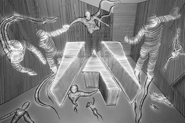
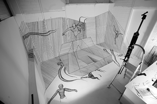
JP ∇ I think I worked around from 60-80 hours on the project, especially for the first version of the logo which was really crazy amount of work with all the lines I had to draw. The tricky part in this project was that in order to create one straight line to the photo I had to correct the lines angle as much as four times a 90 degrees angle in my studio. So basicly one straight line in the photo could go from ceiling to a wall and from there to a door and finally to the floor so you can imagine the work to get it look like a straight line!
LPP ∇ What exactly is a forced perspective drawing?
JP ∇ Forced perspective is a technique that employs optical illusion to make an object appear farther away, closer, larger or smaller than it actually is. It is used primarily in photography, filmmaking and architecture. It manipulates human visual perception through the use of scaled objects and the correlation between them and the vantage point of the spectator or camera.

LPP ∇ Why did you chose a forced perspective, was it just to make it more complicated, lol?
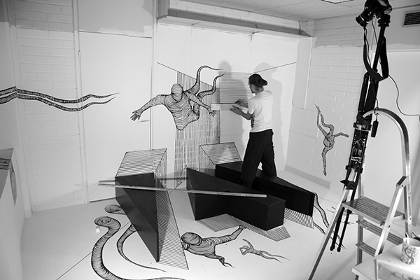
JP ∇ I checked the previous projects in the Remix series and thought that in order to compete with them I had to do also something else besides light painting to my version. I had been experimenting with forced perspective drawings for a year or so so I decided to try to create as complex drawing as I just possibly could. I had planned the drawing to be actually even bigger in size but couldn’t find a place to execute it in so I decided to tear down all the extra stuff from my studio and make the project in there.
LPP ∇ How did building the logo out of wood help you?
JP ∇ I actually thought to use the wooden logo so that I could trace it with light and to make a light painted version of it to the finished photo but gave up from that idea after a few tests. The completely drawn logo worked much more better and created the similar effect without looking too sloppy. The wooden logo helped a lot in visualizing the project though so I’m glad it wasn’t completely in a vain since it was awfully a lot of work to do!
![]()
LPP ∇ Can you tell me a little more about how you lit the scene? How many lights did you use and how did you use them to light the scene?
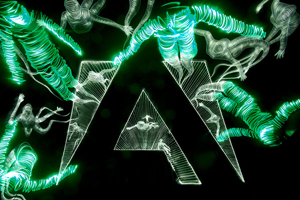
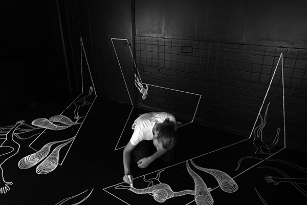
JP ∇ For the b&w versions I used a small Olight flashlight on a low power to light the drawing so that I could highlight the right areas without exposing the drawing too much. The light characters were drawn with a green colored led light because it has more variation in the light trail than a white one in a b&w photo.
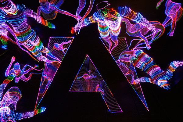
For the multicolored version I traced the drawings from a very close distance with a color changing rgb led in order to get the smooth color changes to the drawing and not to lit the other parts of the photo too much. After that I traced my body to the right locations with a color changing rgb led.
LPP ∇ Did you ever mess up mid exposure and have to start again?
JP ∇ I made something around 20 different versions of the photos with exposures ranging from 16 to 39 minutes so I’m glad none of them had to be started again because of mistakes in the lighting. I forgot the resolution in two versions for the making of resolution though, so ended up with two rather noisy versions (which were luckily on b&w so they didn’t look terribly bad). I worked a couple of weeks till 2 to 5 am and was so exhausted at the end of the day that I didn’t remember to change the camera’s settings before starting to light paint.
LPP ∇ In general when your doing such long exposures do you feel while your shooting that you have messed up and need to start over, or do you always just keep going and then see how the image looks?
JP ∇ I usually just keep going and see how the image looks like because usually my photos are so full of light trails that small mistakes don’t even show in the final photo. Like in my paintings also in my light paintings I believe that mistakes make art sometimes even more interesting.
LPP ∇ You left some of the drawings unfinished, can you explain a little more about how you finished them during the exposure and why you chose to create the image this way?
JP ∇ The intentional unfinished parts in the drawing are the spots where they continue with light painting. After I draw the Adobe logo the unfinished parts were next to draw because I needed to know where the light characters would be in order to compose where to draw the other characters. When I was exposing the photo I tried to place myself so that my body was continuing from the unfinished parts of the drawing and then traced my body with light. It was really a physical challenge sometimes to try to hold the right position while tracing it with light. Especially the figures on the sides of the photo were challenging to do because of the heavy perspective distortions from the 17mm wide angle lens I used.
LPP ∇ I really like your tripod set up. Did you ever accidentally bump the camera and have to move it back into position.
JP ∇ Yeah the tripod set up is a good example of my technical skills! 😀 What you couldn’t do with some duct tape? I wanted to get the camera as high as possible so I figured to use the work ladders and just to tape the tripod to it with the tape. I also taped the ladders to the floor and to a closet so I didn’t have to worry about bumping into it (which I did plenty). I wish I would have done the same thing to my making of camera too since I had great deal of problems with the camera moving during the project when I was editing the video.
LPP ∇ How long were the exposures for your final images?
The multicolored version was 39 minutes of exposure and the b&w version of the white room was 16 minutes.
LPP ∇ Again it is just incredible work thank you for sharing a little more about the project.
JP ∇ Thank you.
For More incredible work check out Janne’s LPP Profile HERE and his website HERE.